Learn container queries, and how to do them in Tailwind
Akashdeep Patra12 Jan, 2023

Before we get started, let's try to visualize the problem for which container queries were created in the first place.
For the sake of simplicity, let's assume we're trying to create a Responsive Card component for a design system.
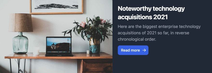
This card component looks something like this on wide screens -
And like this in the case of mobile screens

And the code for this is pretty straightforward. We write some media queries and based on the screen width, we just set the flex direction from column to row (in the mobile-first approach).
But here's the catch, one massive assumption we take in the case of responsive designs is that we think in terms of components. But we write the code based on screen sizes which isn't really how they work in production-grade applications, right?
Your UI doesn't care about the screen size. It only cares about the layout (How it looks in your component tree).
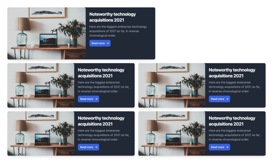
Let's consider this layout for a minute -
To recreate this I'm using React with tailwind but the technology could be used with any framework of your choice.
The code for the Card component is something like this -
1 2 3 4 5 6 7 8 9 10 11 12 13 14 15 16 17 18 19 20 21 22 23 24 25 26 27 28 29 30 31 32 33 34 35 36 37 38 39 40 41 42 43 44 45 46 47import React from 'react'; const Card = () => { return ( <div className=' shadow-lg max-w-[800px] flex flex-col md:flex-row overflow-hidden bg-white border-gray-200 rounded-lg dark:bg-gray-800 dark:border-gray-700'> <a href='#' className=''> <img className='rounded-t-lg' src='https://flowbite.com/docs/images/blog/image-1.jpg' alt='' /> </a> <div className='p-5'> <a href='#'> <h5 className='mb-2 text-2xl font-bold tracking-tight text-gray-900 dark:text-white'> Noteworthy technology acquisitions 2021 </h5> </a> <p className='mb-3 font-normal text-gray-700 dark:text-gray-400'> Here are the biggest enterprise technology acquisitions of 2021 so far, in reverse chronological order. </p> <a href='#' className='inline-flex items-center px-3 py-2 text-sm font-medium text-center text-white bg-blue-700 rounded-lg hover:bg-blue-800 focus:ring-4 focus:outline-none focus:ring-blue-300 dark:bg-blue-600 dark:hover:bg-blue-700 dark:focus:ring-blue-800' > Read more <svg aria-hidden='true' className='w-4 h-4 ml-2 -mr-1' fill='currentColor' viewBox='0 0 20 20' xmlns='http://www.w3.org/2000/svg' > <path fill-rule='evenodd' d='M10.293 3.293a1 1 0 011.414 0l6 6a1 1 0 010 1.414l-6 6a1 1 0 01-1.414-1.414L14.586 11H3a1 1 0 110-2h11.586l-4.293-4.293a1 1 0 010-1.414z' clip-rule='evenodd' ></path> </svg> </a> </div> </div> ); }; export default Card;
And the code for the layout is like this -
1 2 3 4 5 6 7 8 9 10 11 12 13 14 15 16 17 18 19 20 21import Card from './components/Card/Card'; function App() { return ( <div className='App p-10 flex flex-col gap-5 justify-center'> <Card /> <div className='gap-5 max-w-[100vw] flex flex-col'> <div className='flex flex-col md:flex-row gap-5'> <Card /> <Card /> </div> <div className='flex flex-col md:flex-row gap-5'> <Card /> <Card /> </div> </div> </div> ); } export default App;
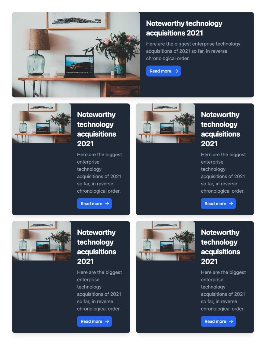
Now let's try to shrink the viewport very slowly (Like really slowly!)
If you're not cheating! at some point, your layout would look something like
And the reason is that although your Card is responsive, it isn't aware of its surroundings and where it's being used, And that is why Container queries were introduced.
This is based on the CSS containment specs, which say, "CSS containment provides a way to isolate parts of a page and declare to the browser these parts are independent of the rest of the page in terms of styles and layout".
And for this example, we also have a surprise, tailwind's latest version now supports container queries with a new plugin called @tailwindcss/container-queries.
Let's try to fix our code by segregating the layout into different containers. Our app's code is now like this -
1 2 3 4 5 6 7 8 9 10 11 12 13 14 15 16 17 18 19 20 21 22 23import Card from './components/Card/Card'; function ContainerApp() { return ( <div className='App p-10 flex flex-col gap-5 justify-center'> <div className='@container/main'> <Card /> </div> <div className='gap-5 max-w-[100vw] flex flex-col'> <div className='flex @container/grid flex-col md:flex-row gap-5'> <Card /> <Card /> </div> <div className='flex @container/grid flex-col md:flex-row gap-5'> <Card /> <Card /> </div> </div> </div> ); } export default ContainerApp;
If you carefully notice, we added two different containers having names main and grid, which will point to two different types of cards. And yes, tailwind supports named containers as well.
So our modified version of the card component is now -
1 2 3 4 5 6 7 8 9 10 11 12 13 14 15 16 17 18 19 20 21 22 23 24 25 26 27 28 29 30 31 32 33 34 35 36 37 38 39 40 41 42 43 44 45 46 47import React from 'react'; const ContainerCard = () => { return ( <div className=' shadow-lg max-w-[800px] flex flex-col @[620px]/main:flex-row @[1224px]/grid:flex-row overflow-hidden bg-white border-gray-200 rounded-lg dark:bg-gray-800 dark:border-gray-700'> <a href='#' className=''> <img className='rounded-t-lg' src='https://flowbite.com/docs/images/blog/image-1.jpg' alt='' /> </a> <div className='p-5'> <a href='#'> <h5 className='mb-2 text-2xl font-bold tracking-tight text-gray-900 dark:text-white'> Noteworthy technology acquisitions 2021 </h5> </a> <p className='mb-3 font-normal text-gray-700 dark:text-gray-400'> Here are the biggest enterprise technology acquisitions of 2021 so far, in reverse chronological order. </p> <a href='#' className='inline-flex items-center px-3 py-2 text-sm font-medium text-center text-white bg-blue-700 rounded-lg hover:bg-blue-800 focus:ring-4 focus:outline-none focus:ring-blue-300 dark:bg-blue-600 dark:hover:bg-blue-700 dark:focus:ring-blue-800' > Read more <svg aria-hidden='true' className='w-4 h-4 ml-2 -mr-1' fill='currentColor' viewBox='0 0 20 20' xmlns='http://www.w3.org/2000/svg' > <path fill-rule='evenodd' d='M10.293 3.293a1 1 0 011.414 0l6 6a1 1 0 010 1.414l-6 6a1 1 0 01-1.414-1.414L14.586 11H3a1 1 0 110-2h11.586l-4.293-4.293a1 1 0 010-1.414z' clip-rule='evenodd' ></path> </svg> </a> </div> </div> ); }; export default ContainerCard;
As you can see at the top level, we just added the classNames -
- @[620px]/main:flex-row: which says for Cards that are defined inside the main container, if the top level main container's width is more than 620px, the flex-direction would change to row
- @[1224px]/grid:flex-row: which says for Cards that are defined inside the grid container, if the top-level grid container's width is more than 1224px, the flex-direction would change to row
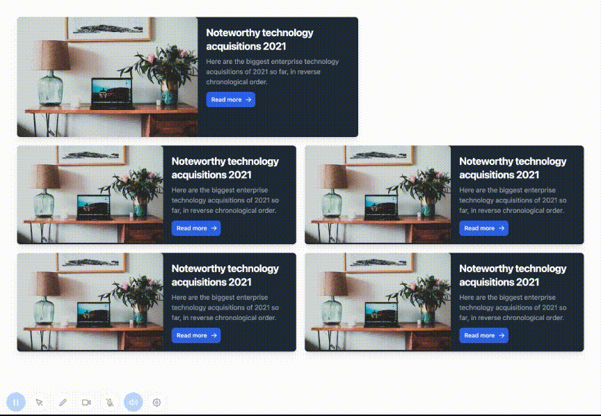
The two sets of styles are completely independent of each other. So after the changes, your layout should look something like this -
This gives you the ability to make your components aware of the layout.
The support for container queries is spreading like wildfire, it's going to be the new age of writing component-driven layouts, and container queries are gonna be the tool that will pave the way.
I'm including the working Stackblitz for reference.

